Atlanta street art project
An Android application allowing users to discover, explore, and share street art throughout Atlanta.
Role: UI/UX Designer
August 2016-May 2017
THE PROBLEM
There are more than 800 works of public art on the walls all around Atlanta, yet no efficient or centralized way to locate these pieces of art.
The actions
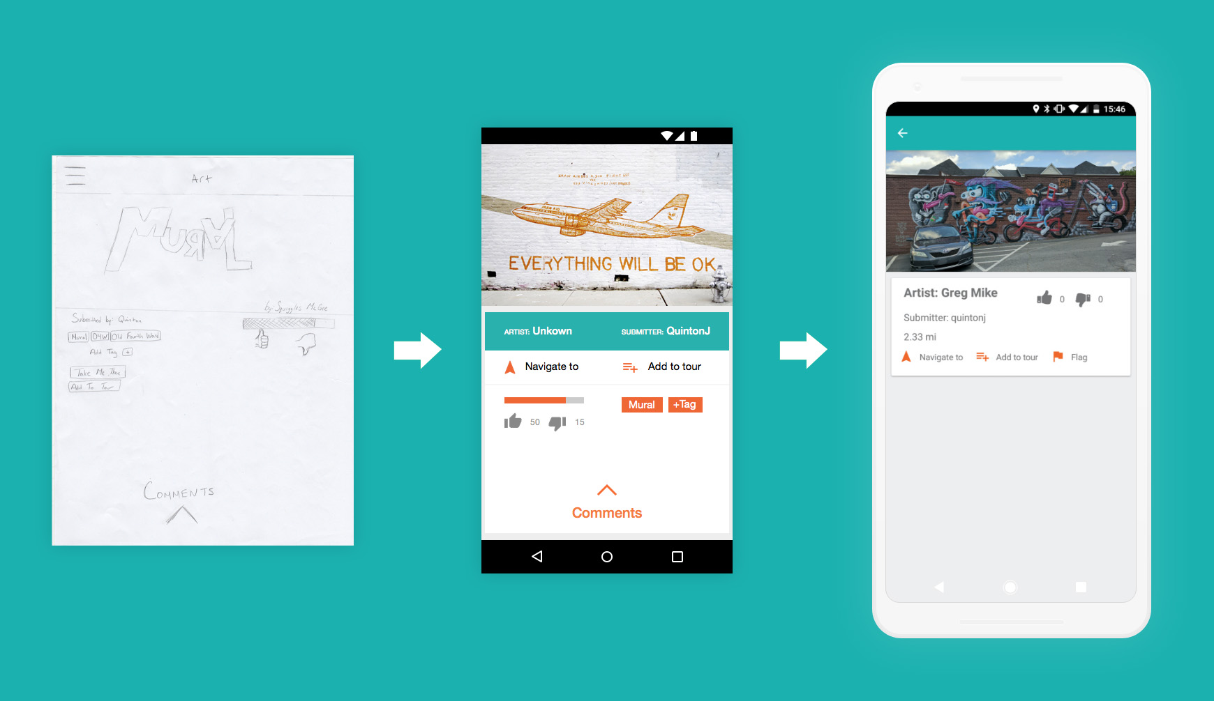
We began the project by meeting with our client to determine what expectations and non-negotiables they had for the application as well as where our team had freedom for creativity. After establishing guidelines and a contract with our client, we developed user personas and identified user stories. Our team believed that the majority of users would be residents in their late teens to late twenties who lived in-town in Atlanta (locally known as “within the Perimeter”). With personas and stories created, we produced concepts for the user interface by drawing up ideas on a whiteboard together. As we did this, we were also able to determine what features our team would like to prioritize and how these features would interact. With this information, we were able to put together and lo-fidelity pen and paper prototype.
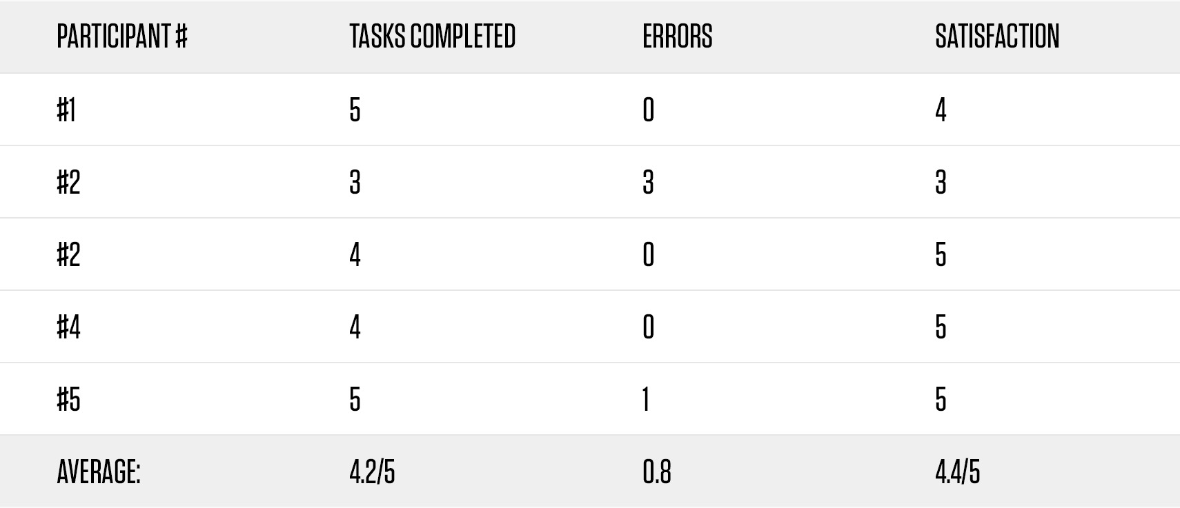
Using the pen and paper prototype, we conducted five usability tests to ensure that our designs were effective with target users. In these tests, we asked the users to complete five tasks and to walk us through their thoughts as they progressed through each task, which included: logging in, creating an account, creating a tour of art, finding art nearby, and submitting art. During these tests, we recorded the number of tests completed, time to complete each task, and any errors that occurred, as well as general feedback on the process.
Using the information gathered from these tests, we were able to identify some issues with our designs, such as the layout and process of logging and the usability of the neighborhood screen. After these issues were identified, we refined our pen and paper prototype and every screen was converted to an interactive, hi-fidelity prototype in Sketch.
With a refined, hi-fidelity prototype to reference, we began implementing all features as an Android application. The app has since been updated and published to the Google Play Store.


The result
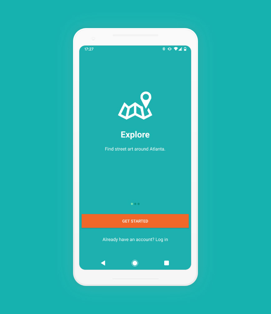
An Android application created for a client who wished there to be a centralized way to discover, share, and explore street art around the city of Atlanta.
Lessons Learned
1. The client’s happiness through the process will make everything much simpler. It was important to check in with our client biweekly to give updates on where our team was with the application and even what obstacles we were encountering at the time so that they would be able to understand the entire process and why there may be any delays on certain components. In these meetings, we showed the client things such as our user stories, design ideas, and our final implementation to make sure they were clued in every step of the way.
2. If obstacles come up during your work, seek help quickly, do not wait. Our team learned a lot through the creation of the application, but also ran into many obstacles. When we worked to get through them as a team, they did not turn into as large of issues as when we tried to tackle them alone.
3. When conducting user testing, make sure that within a demographic of users, you are accounting for comfortability/familiarity with technology in general. During our user testing it was easy to get past pain points in our prototype by simply having more experience with technology compared to those who failed to complete a task because they could not get past that obstacle. Without a variety in experience with technology, some of these pain points could very easily be overlooked.